Recently I had the opportunity to illustrate a cover story by the talented—and often very humorous—Dustin Waters on the history of the Satanic Panic in South Carolina. It’s a great read, detailing how public fear of devilish dealings in the Lowcountry went as far back as the 1800’s with a hoax perpetrated by a French writer attempting to get on the Catholic Church’s good side by libeling the Freemasons. According to the writings, their Satanic temple was located in Charleston.
The article goes on to discuss the panic of the ‘80s and ‘90s when parents feared that rock, movies, and games like Dungeons & Dragons were swaying the children over to the dark side.

I approached this illustration with the idea of a riff on the classic x-ray specs ads that were found in comic books when I was a kid. The glasses falsely claimed to allow you to see what wasn’t there, so I naturally felt that this would be a great analogy.
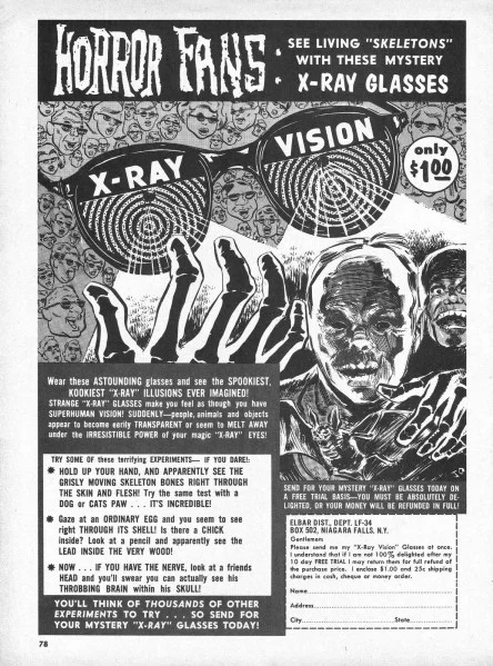
These ads used to be all over comic books.
Living in the Holy City, I aimed to make Baphomet and the other devils as non-threatening as possible—who knows what kind of reader fallout there would be if they were depicted as less family-friendly devils? But even so, reports were that my cheery demonic depictions, at the very least, caused a couple of delivery drivers to refuse work that day. You can’t please everyone.